|
I haven't spent as much time on this project as I have others, but it still looks decent. I originally had plans to make this super realistic and not stormy, but I changed my mind. It is kind of like a second rendition of my previous stormy painting on raw canvas. At first, the sky was all one color but I decided to make it fade from dark at the top to light on the bottom. I wanted the ocean and sky to seem to blend together, but it was a bit difficult. I used many colors in the water, my two favorite ones being black and hooker's green. The green was to give the illusion of transparency, and the black was to accentuate the dark spots in the water and accent the stormy clouds. The part that I struggled with the most in this project was definitely the sky. Stormy clouds are very hard to emulate, and while I'm okay with the ones I've painted, I might retouch them later on. 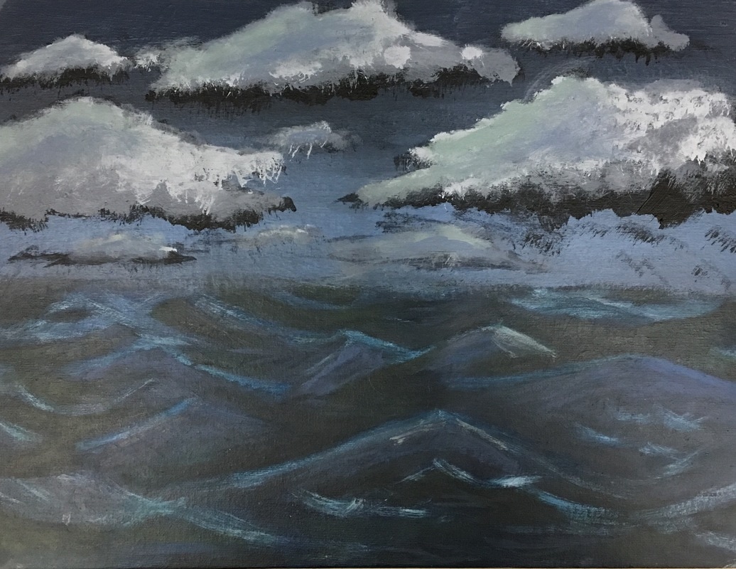
0 Comments
|
Archives
January 2017
CategoriesAuthorJust a seventeen year old with a passion for art. |
 RSS Feed
